I am a User Experience Designer
Getting the big picture
The internship started with understanding Qure.ai & its products

Researching Products
Researching & using Qure.ai's products

On Site Visits
On Site Visits to Chikkaballapur hospital to understand our target audience, product usage & location of utility

Interaction with different teams
Understanding the perspectives of different kinds of teams
ABOUT THIS INTERNSHIP
I was working in the Design team & my first task was to work on the UI Design of the Worklist/Patient list. We tweaked the Visual Design until it worked for every team involved & was functional at its best. We believed in constantly taking feedbacks & keeping all necessary teams involved throughout the process.
ROLE
UI Design
UX Design
Illustrating
Dev communication
PROJECT TYPE
Team Project
TIMELINE
Jul'22-Sep'22
TOOLS USED


The Qure App is on PlayStore & the same designs which are in the portfolio have been deployed in it.
Iterate, Iterate, Iterate...

What is Qure App?
This app quickly updates radiologists with patient updates.
Through the Qure app, radiologists may easily access and keep track of patients' scans. It also has a desktop version, but we worked on the mobile version so that users could get scans fast when, for example, a doctor was on the go and needed to obtain a scan quickly for an emergency or to alert another doctor to an emergency.
The doctor has access to all types of scans, can communicate directly with the patient through the patient channel, and may verify AI readings for the likelihood of serious disorders.
Task #1
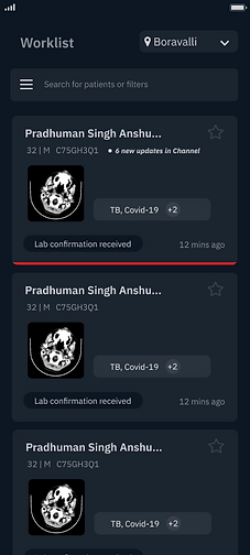
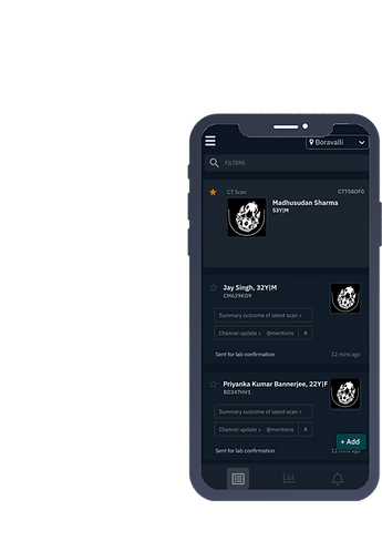
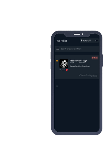
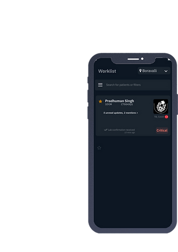
Worklist Visual Design
Starting Point
Listing Down all the Components
I started with listing down all the components in the wireframe & understanding about each one of them in detail by referencing the current user flow of the app

Final Design

Side Menu
Select Site filter
Search Bar
Patient Card
Viewer
Patient Channel
Reviewing & Editing each Component
Finding optimum ways to fullfill the task performed by each component
Iterations

1.
Tried turning this 'Select Site' button into a filter It didn't work because once the 'Search Panel' is clicked, it would also have a filter & two filters will confuse the user.


Adding icons & box to depict that this is a universal button which is going to stay throughout the app

2.
3.


Adding Headings to let the user know the purpose of the screen at all times


4.
Colour codings to depict various statuses of the variable components
5.

..but not using colours generously because they get distracting too


Adding more visual elements instead of text
6.


Rearranging the components
Further iterations


The Final Design
The final design gives much importance to the thumbnail. Prominent options are represented by icons. Hierarchy is correctly in place & unnecessary information is removed.
Algorithms are great, but design brings them to life

Task #2
Notifications Visual Design
Goals I set for this task
Quick identification
Quick identification of different kinds of notifications
Comprehension at glance
Users don't need to tap on each notification to know what's inside
Correct Prioritisation
Prioritise notifications on the basis of urgency

Actionable notifications
Perform actions from the notification itself
Types of notifications
Emergency
Uploads successful
Collaboration request
Lab Confirmation pending..
Report updated
Patient info filled
Scans uploaded successfully
Error in uploading scan!
System update
Screened by Qure.ai
Code Stroke
Mentions
New Patients Registered
Sorting in
groups
Error uploading
Collaboration request
Mentions
System update
Screened by Qure.ai
Emergency
Report updated
Scans uploaded successfully
Patient info filled
Uploads successful
Lab Confirmation Pending
New Patients Registered
Code Stroke
System update
Screened by Qure.ai
Prioritising
Uploads successful
Scans uploaded successfully
Report updated
Patient info filled
Collaboration Request
Mentions
Error uploading
Code Stroke
Lab Confirmation Pending
Emergency
Prioritising on the basis of anticipated urgency
Similar icons for one group


Use of Colour


Usage of colours for emphasis
Final Designs

Task #3
Creating an instruction Manual
Challenges
Varied users
Need an
effortless manual
Non tech savvy users
Should be apt for emergency situations
Rural users
Require least
learning curve


